Platform Tech
Patients may Schedule appointments

Provider to Provider Referral

Progress
Select measures, explore date ranges and export to a chart note.
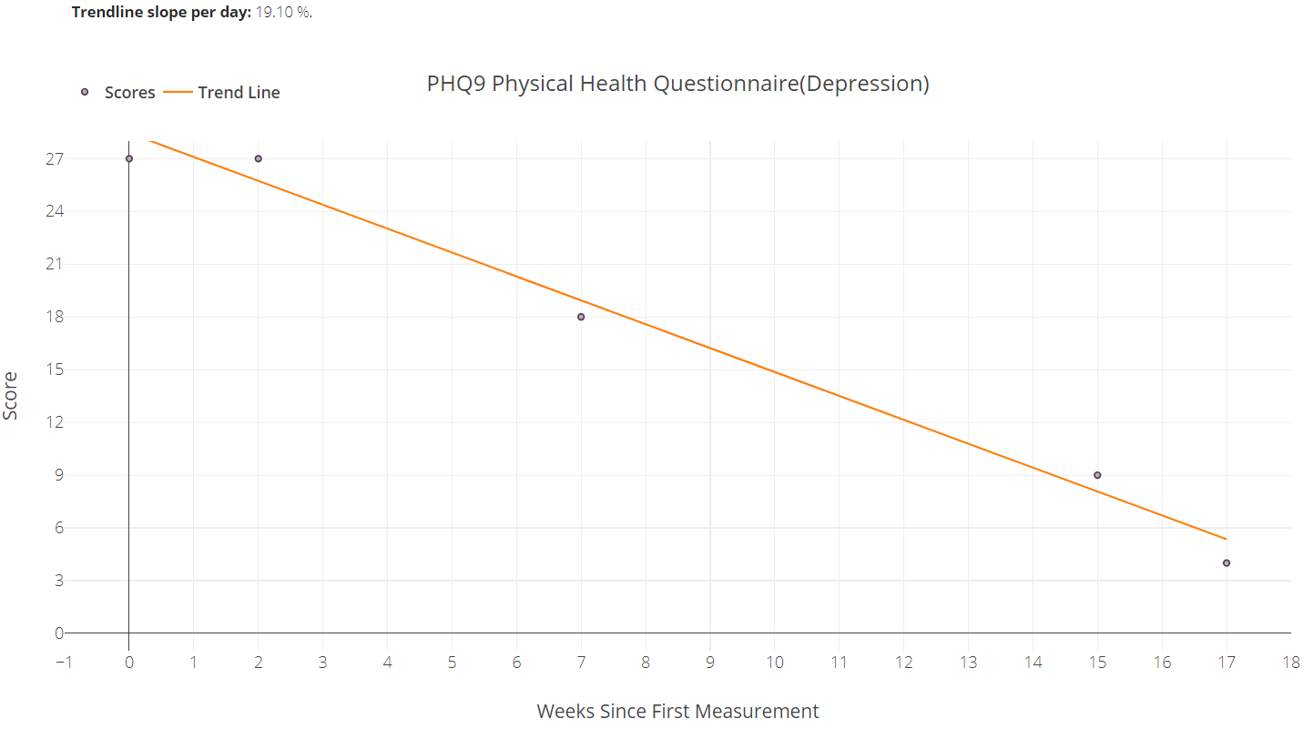
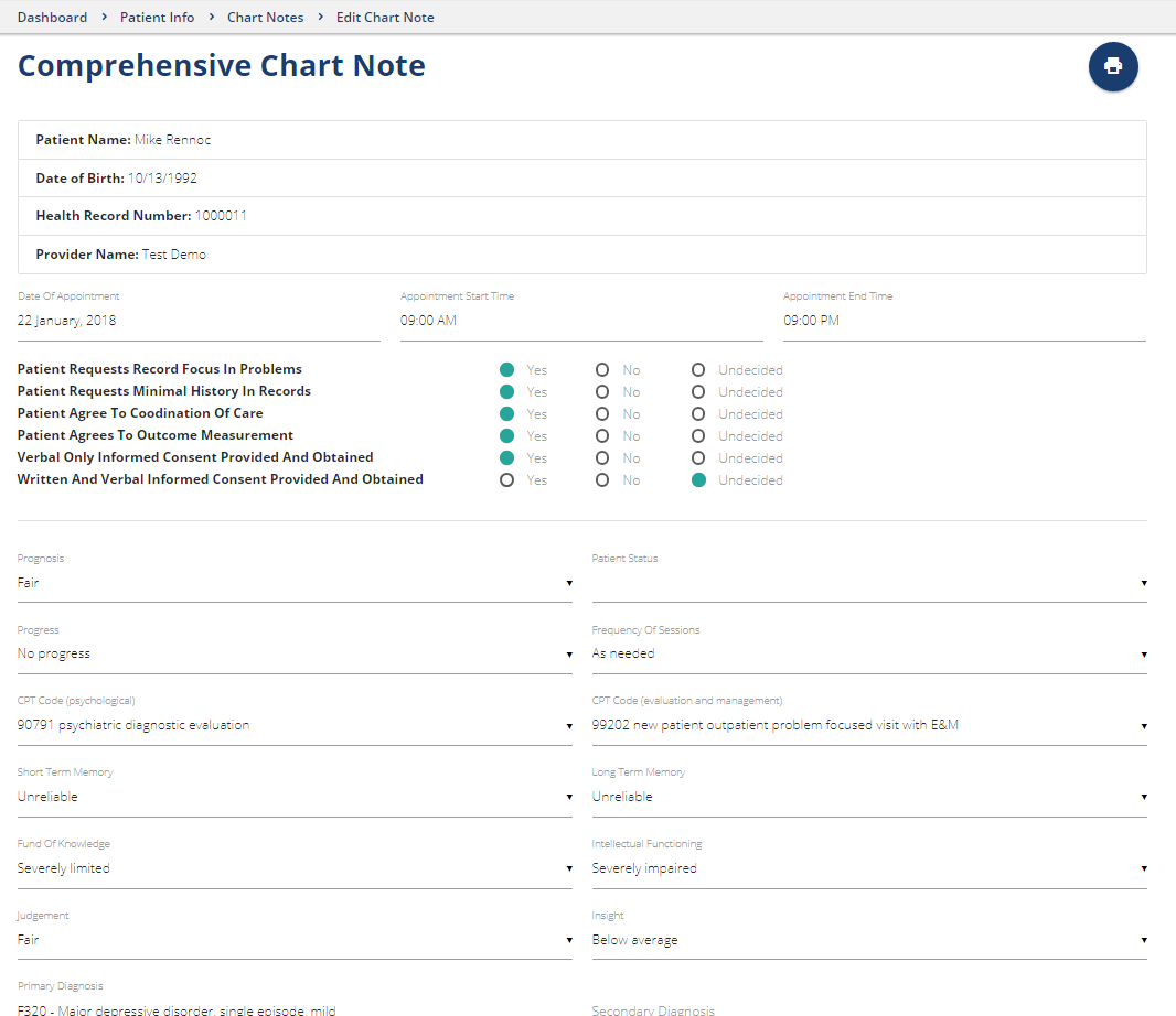
Chart Notes
Create basic, comprehensive, progress, coordinated care and medical necessity notes with HIPAA assurance...
Quality based on Normalized Costs and Outcomes
Today’s behavioral health providers know all too well that their services may sometimes be viewed by payers and funders as merely a product with a price tag. Meanwhile, providers struggle to manage thier own costs while delivering quality clinical services. The good news is that with reliable data, providers can do both confidently – measure the effectiveness of management and clinical practices, identify meaningful opportunities to improve their delivery of care and demonstrate valuable outcomes to public and private payers.
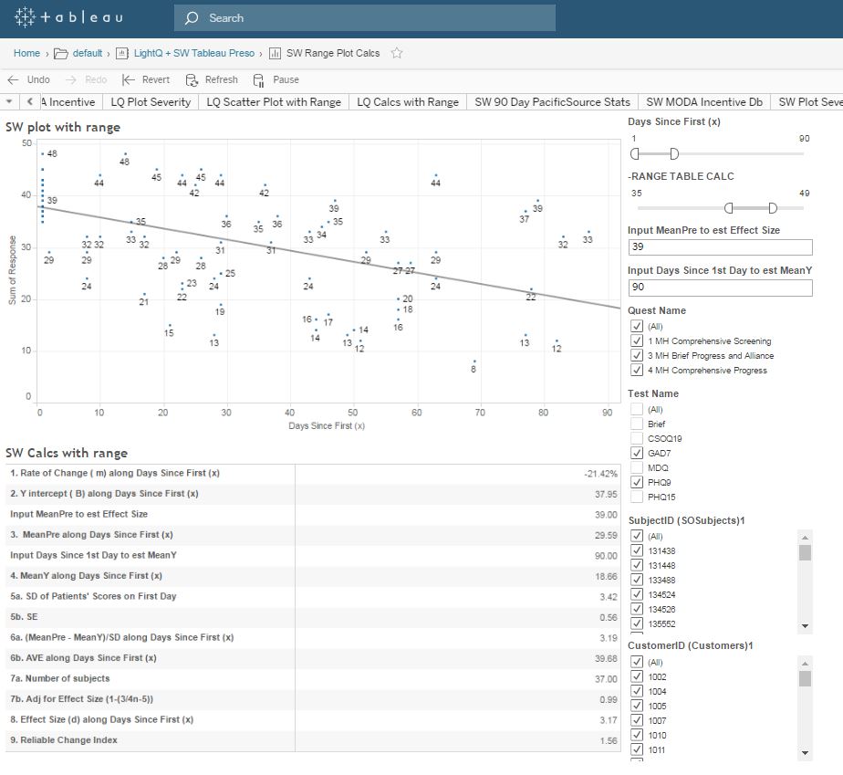
Visual analytics can give providers and Healthplans the ability to compare normalized costs with outcomes; to visualize individual and group performance as well as quality in terms of reductions of symptom burden and changes in a patient’s functioning and quality of life.
The following graph in an online interactive tool providers and Healthplans can use to aggregate and evaluate patient reported outcome measures (PROMs) comparing effect size, rate of change and reliable change index referencing diagnosis, case mix severity, individual providers and provider groups.
The Tableau visual analytic dashboard generates graphs like the following which illustrates the normalized average cost of four providers on the basis of four CPT codes. These are average unit cost comparisons.

In using the graph above, the challenge of utilization review is that the auditor can only focus on utilization of CPT codes identifying those that deviate significantly from an average. Efforts by Healthplans to interact with providers to reduce costs is invariably met with some degree of resistance or outright objection. Providers’ justifiable resistance often includes:
“My patients are sicker.”
“The patients you are comparing me to are not my patients.”
One potential solution is to engage providers with each other to manage cost and quality. The Tableau visual analytic dashboard can generate a graph like the following to illustrate the relationship between cost and outcomes. The highest performing providers (greater quality) are those in the upper right quadrant because their cost is less than average and their outcomes are significantly better than average.

Software for a range of member Benefits
Website owners and administrators can offer association quality benefits and offset membership dues by providing an online referral directory, appointment booking, questionnaires, charting, measurement, visual analytics and contracting capability.
